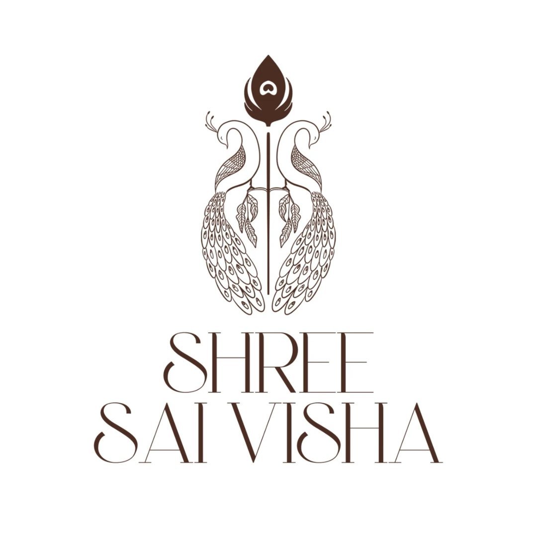
Creating the identity for Shree Sai Visha wasn’t just a branding exercise it was a deep storytelling process. The founder envisioned a label that blended traditional elegance with divine symbolism, and we brought that vision to life through a brand identity rooted in meaning. The logo features twin peacocks, symbols of beauty, grace, and poise, paired with the Vel, the sacred spear of Lord Murugan, representing strength and protection. Every colour, form, and typeface choice was deliberate, ensuring no detail was overlooked.
Beyond the logo, we built an exhaustive brand manual covering tone of voice, visual language, and typography. The final identity is a perfect blend of legacy and aspiration, allowing the brand to speak to both its cultural roots and contemporary fashion sensibilities. This wasn’t just about looking good; it was about feeling right. Shree Sai Visha now has a brand system that can evolve with scale, yet remain deeply personal. It’s the kind of work that reminds us why great branding is both an art and a responsibility.